Use Data to Optimize Your Supply Chain (Part 1)

At Shipwell, we believe in the power of analytics. Shippers, 3PLs, and carriers generate thousands if not millions of unique points of data across the entire supply chain. Having as much data-driven insights as possible empowers logistics professionals to optimize their operations.
But, not everyone is a data scientist. Time and resources are also limited, therefore, there is a high-priority need for easily digestible, visual means of viewing the data you're collecting.
Plus, above all, your data must be accurate, visibile in real-time, and reflect critical points in your operation to identify what can be improved.
Recently, we've implemented even deeper analytics access in the Shipwell platform to further empower our Shipwell community. Read about what's possible in freight tech now, and click the button below to get a personalized demo.
Shipping Overviews for a powerful look at your overall supply chain
With the updated Shipping Overview Dashboard in Shipwell Analytics, there are several high-level data visualizations to dive into.
Please note, the following charts and visualizations contain sample data for example purposes only.
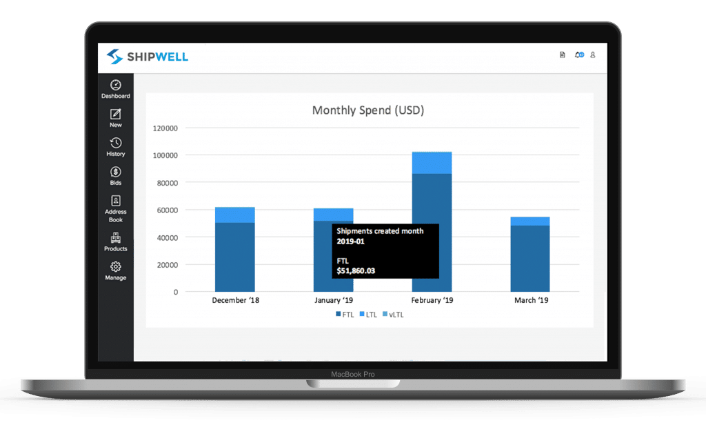
Monthly Spend gives you an overall look at how much your FTL, LTL, and vLTL, cost is month-over-month. It's a great way to understand which modes of shipping contribute the most to your overall budget.

Looking at Average Cost per Pound provides clarity around how much you're spending to move your unique goods down to the pound. This data is also sliceable between FTL, LTL, and vLTL modes.
Then, looking at Average Cost per Mile gives you access to your overall carrier rates month-over-month per mode, per mile.

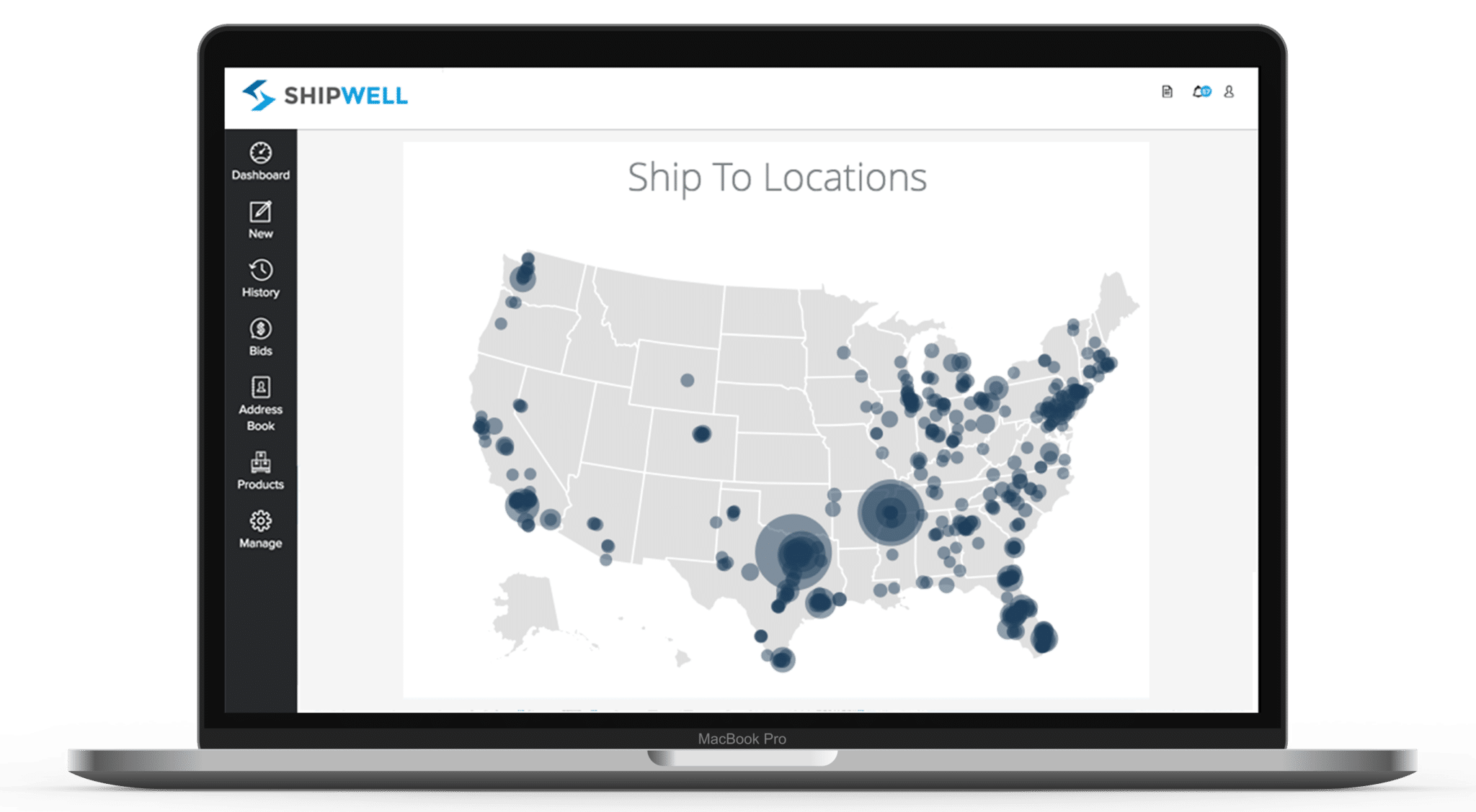
With a more complex supply chain, you'll be shipping from multiple locations with various delivery points. Our heatmaps provide a quick and easy way to digest your most popular shipping locations.

Dive into this deeper with Average Lane Stats. In this chart, you'll see a ranking of:
- Your shipping lanes
- Their total packages and shipments
- Total amount of spend
- Average weight of handling units
- The lane's activity as a percent of your total supply chain
- Total weight shipped
- Average cost per handling unit
All of the above data visualizations are filterable, meaning you can look at your supply chain data across any length of time.
There are even more data points to view in the Shipping Overview Dashboard in Shipwell that will optimize the way you run your freight operations.
Want to see more? Let us know your logistics challenges and request a demo below!


.svg)


